Documentation
Hey there! You’re looking at Anchor UI Bootstrap KIT official documentation. Anchor is a free Bootstrap UI Kit with flexible, ready to use UI components which will hep you build websites faster. Let’s begin!
Quick Start
File Structure
- assets/
- css/
- vendor/
- aos.css
- prism.css
- main.css
- main.css.map
- img/
- js/
- vendor/
- jquery.min.js
- bootstrap.min.js
- popper.min.js
- aos.js
- functions.js
- scss/
- 1-frameworks/
- bootstrap/
- source/
- bootstrap.scss
- bootstrap-grid.scss
- bootstrap-reboot.scss
- bootstrap-user-variables.scss
- _index.scss
- 2-plugins
- 3-base
- 4-modules
- 5-layout
- main.scss
- index.html
- blog.html
- landing.html
- page.html
- login.html
- starter-template.html
- docs.html
- gulpfile.js
- package.json
- README.md
Basic Template
<!DOCTYPE html>
<html lang="en">
<head>
<meta charset="utf-8"/>
<link rel="apple-touch-icon" sizes="76x76" href="./assets/img/favicon.ico">
<link rel="icon" type="image/png" href="./assets/img/favicon.ico">
<meta http-equiv="X-UA-Compatible" content="IE=edge,chrome=1"/>
<title>Site Title</title>
<meta content='width=device-width, initial-scale=1.0, maximum-scale=1.0, user-scalable=0, shrink-to-fit=no' name='viewport'/>

<!-- Fonts -->
<link href="https://fonts.googleapis.com/css?family=Nunito:300,300i,400,600,700" rel="stylesheet">
<link rel="stylesheet" href="https://use.fontawesome.com/releases/v5.3.1/css/all.css" integrity="sha384-mzrmE5qonljUremFsqc01SB46JvROS7bZs3IO2EmfFsd15uHvIt+Y8vEf7N7fWAU" crossorigin="anonymous">

<!-- CSS -->
<link href="./assets/css/main.css" rel="stylesheet"/>
<link href="./assets/css/vendor/aos.css" rel="stylesheet"/>

</head>

<body>

<main> My content goes here </main>

<!-- Javascript -->
<script src="./assets/js/vendor/jquery.min.js" type="text/javascript"></script>
<script src="./assets/js/vendor/popper.min.js" type="text/javascript"></script>
<script src="./assets/js/vendor/bootstrap.min.js" type="text/javascript"></script>
<script src="./assets/js/functions.js" type="text/javascript"></script>

</body>

</html>
Install Gulp
Gulp can automate tasks in your development workflow. Gulp is also required in order to work with scss files. In order to use Gulp you will need to download Node JS first:
After Node is installed you can now proceed to Gulp installation. To do that simply run the following command in your terminal. This will install Gulp globally. Aferwards you can cd to you project’s folder where our KIT is installed.
npm install gulp-cli -g
Customize with SCSS
It is highly recommended that all the customized styles to be stored only within the user’s files from the scss folder. Gulp is required for this.
- Download the project’s zip.
- Make sure you have node.js (https://nodejs.org/en/) installed.
- Type
npm installin terminal/console in the source folder wherepackage.jsonis located. - Make sure you have gulp
npm install gulp - Run in terminal
gulp open-appfor opening the Dashboard Page (default) of the product. - Run in terminal
gulp compile-scssfor a single compilation orgulp watchfor continous compilation of the changes that you make in*.scssfiles. This command should be run in the same folder wheregulpfile.jsandpackage.jsonare located.
assets/scss/frameworks/bootstrap/bootstrap-user-variables.scss(here you can edit or add variables)assets/scss/main.scss(here you will customize your style)
main.css.
Components
Colors
- Background:
bg-*color - Text:
text-*color - Alert:
alert-*color - Button:
btn-*color - Badge:
badge-*color
Primary
Secondary
Info
Success
Warning
Danger
Purple
Black
Cyan
White
Orange
Light
Alerts
- Background:
alert-*color - Text:
text-*color - Shadow:
shadow,shadow-sm,shadow-lg
Animations
-
Fade animations:
- fade
- fade-up
- fade-down
- fade-left
- fade-right
- fade-up-right
- fade-up-left
- fade-down-right
- fade-down-left
-
Flip animations:
- flip-up
- flip-down
- flip-left
- flip-right
-
Slide animations:
- slide-up
- slide-down
- slide-left
- slide-right
-
Zoom animations:
- zoom-in
- zoom-in-up
- zoom-in-down
- zoom-in-left
- zoom-in-right
- zoom-out
- zoom-out-up
- zoom-out-down
- zoom-out-left
- zoom-out-right
AOS.init({ duration: 800 });
Add animation effect with data-aos="*animation". Example:
Avatars
- Round:
rounded-circle - Size:
width="*" - Shadow:
shadow,shadow-sm,shadow-lg
Badges
- Background:
badge-*color - Text:
text-*color - Shadow:
shadow,shadow-sm,shadow-lg
Buttons
- Background:
btn-*color - Text:
text-*color - Size:
btn-sm,btn,btn-lg - Outline:
btn-outline-*color - Round:
btn-round - Width:
btn-block w-100 - Shadow:
shadow,shadow-sm,shadow-lg
Call to action
- Background:
bg-*color - Text:
text-*color - Shadow:
shadow,shadow-sm,shadow-lg - Not round:
jumbotron-fluid
Free Bootstrap 4.1.3 UI Kit with for rapid development
Free Bootstrap 4.1.3 UI Kit with for rapid development
Call to actionFree Bootstrap 4.1.3 UI Kit with for rapid development
Cards
- Shadow:
shadow,shadow-sm,shadow-lg - No border:
border-0 - No rounded:
rounded-0
Simple Card
Just a card
Some quick example text to build on the card title and make up the bulk of the card's content.
Read MoreCard Overlay
Featured Blog Card
Living the Dream on a Sunny Island
This is a wider card with supporting text below as a natural lead-in to additional content.
Continue reading
Carousel
- Shadow:
shadow,shadow-sm,shadow-lg - Rounded:
rounded
    $('.carousel').on('slide.bs.carousel', function (event) {
      var height = $(event.relatedTarget).height();
      var $innerCarousel = $(event.target).find('.carousel-inner');
      $innerCarousel.animate({
        height: height
      });
    });
Footer
- Background:
bg-*color(apply tofooterandsvgclasses. - Text Color:
text-*color
Dark Footer
Light Footer
Minimal Footer
Forms
- Rounded:
input-round
Inline Form
Sign Up Form
Contact Form
Features
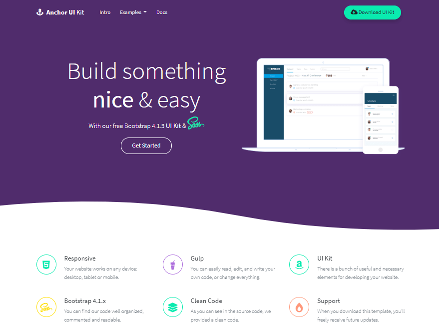
Responsive
Your website works on any device: desktop, tablet or mobile. It will look great!
Gulp
You can easily read, edit, and write your own code, or change everything.
UI Kit
There is a bunch of useful and necessary elements for developing your website.
Headers
- Background color:
bg-*color(apply tojumbotron&svgclasses) - Text color:
text-*color
Wavy Header
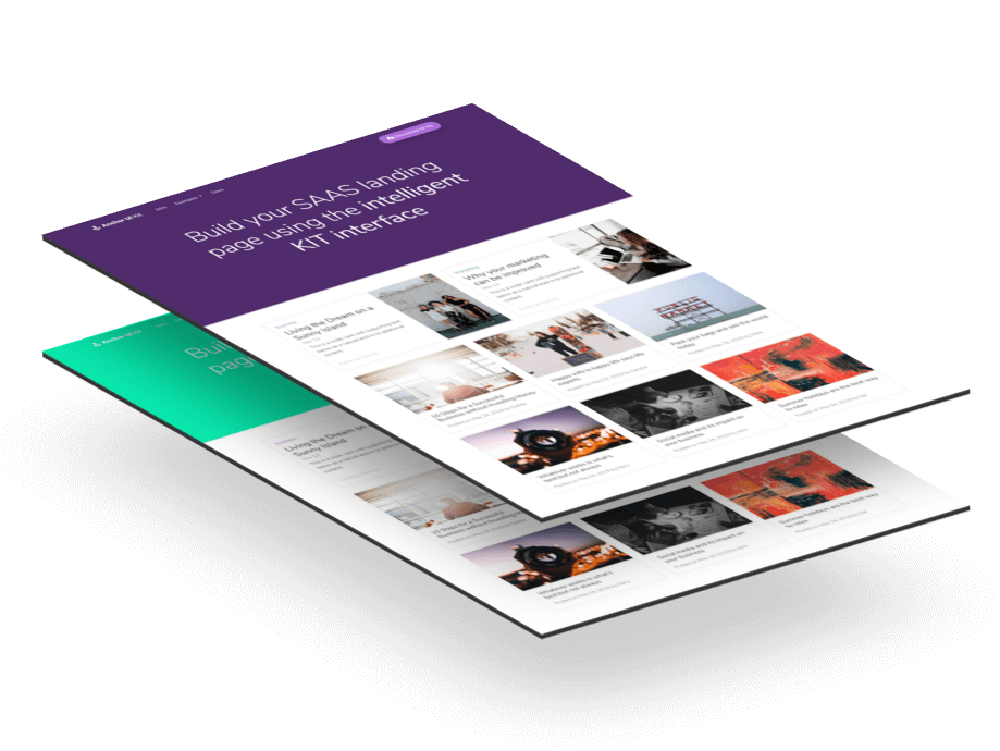
Simple Header
This is a title
Header with Nav
This is a title
Icons
Anchor UI Kit comes with latest Font Awesome, the web’s most popular icon set and toolkit. Here are all the available icons.
- Color:
text-*color - Size:
fa-2x,fa-3x
- Color:
text-*color - Size:
iconsmall,iconmedium,iconlarge - Circle:
rounded-circle - Shadow:
shadow,shadow-sm,shadow-lg
- Background:
bg-*color - Size:
iconsmall,iconmedium,iconlarge - Circle:
rounded-circle - Shadow:
shadow,shadow-sm,shadow-lg
Bordered Icons:
Background Icons:
Jumbotron
- Background color:
bg-*color - Size:
jumbotron-md,jumbotron-lg,jumbotron-xl - Text color:
text-*color
Jumbotron Simple
Anchor UI Kit
Free Bootstrap 4.1.3 UI Kit with for rapid development
Jumbotron with Background Image
Modals
Navbars
- Background color:
bg-*color - Text color:
navbar-dark,navbar-light - Fixed:
fixed-top - Fixed white bg on scroll:
topnav
Dark Navbar
White Navbar
You can change the color by replacing bg-primary with any of the other colors. If you choose a light background you will want a dark text, so change navbar-dark with navbar-light. See the example below for a white bg navbar.
Fixed Navbar
Add fixed-top to the nav class to have a fixed navigation.
topnav. This changes the navigation background color on scroll to bg-white. The call is in assets/js/functions.js on line 4.
Pagination
Popovers
- Placement:
data-placement="top/right/bottom/left"
$(function () {
$('[data-toggle="popover"]').popover()
})
$('.popover-dismiss').popover({
  trigger: 'focus'
})
Pricing
- Background color:
bg-*color(apply tocard-header) - Button color:
btn-*color - Text-color:
text-*color - Shadow:
shadow-sm,shadow,shadow-lg(apply tocard)
Personal
$11 / mo
- 10 users included
- 2 GB of storage
- Email support
- Help center access
Premium
$15 / mo
- 20 users included
- 10 GB of storage
- Priority email support
- Help center access
Enterprise
$29 / mo
- 30 users included
- 15 GB of storage
- Phone and email support
- Help center access
Table
| # | First | Last | Handle |
|---|---|---|---|
| 1 | Mark | Otto | @mdo |
| 2 | Jacob | Thornton | @fat |
| 3 | Larry | the Bird |
Tooltips
- Placement:
data-placement="top/right/bottom/left"
$(function () {
$('[data-toggle="tooltip"]').tooltip()
})
